VoteReady: Voter Preparation App and Site
VoteReady is an app and website that helps users register to vote, update their registration and educates them on voting in the hopes of increasing civic participation.
Date: July 2023
Tool Used: Figma
Role: UX Designer and Researcher
Sample completed Mockups

App Home

App - How to Register

App - Updating Registration

Desktop - Home

Desktop - How to Register

Desktop - Updating
Project Goal
Create an app and site that will include information on voter registration, polling places, voter rights and an election guide to help new or returning voters be educated voters.
What problem is voteready trying to solve?
Voter information is often scattered in multiple sites, such as how to register, what is on the ballot, and general information. In addition, the sites that are dedicated to voting are often government ran, use technical language and cluttered with too much information for the average voter.
Paper wireframes
After researching, including running a competitive audit, I narrowed the focus of the project to be local, as many of the more confusing aspects of other sites were that laws greatly differ from state to state. I also decided to focus on an app at first, to better reach younger people, the population that is the least likely to vote.

Digital Wireframes and Lo-Fi Prototypes
I created digital wireframes and lo-fi prototypes for the app first and tested it in a usability study (findings below). I then created wireframes and prototypes for a desktop site and a mobile site as well. Sample wireframes can be found below.

App - Home

App - How to Register

App - Election Guide

Desktop Site - How to Register

Desktop Site - Check Registration

Desktop Site- Voting FAQ

Mobile Site - Home

Mobile Site - Check Registration

Mobile Site - Updating Registration
usability Study- Findings
I completed a usability study on my app prototype to get valuable feedback from potential users.
Menu and Navigation bar location
The button to view the menu in the prototype was too small, making it hard for users to find or click. In addition, the navigation bar was too small and too high for users to naturally find.
Titles of pages and buttons
Some of the buttons did not match the title of the pages, causing confusion while navigating. For example, a button may say “How to Register” but the page is titled “Registering to Vote”.
Buttons
Users greatly preferred navigating with the buttons placed around the site with links to relevant content, over the menu,
Mockups
-
After the study, I enlarged the menu button and made the navigation bar more user friendly. I also added relevant buttons like “how to register” and simplified the title to “check registration”

-
I also updated the titles of other pages to be easier to understand and reflect navigation / buttons better. I also added buttons to download forms for ease of use.

Full Mockups
App Mockups
App Home
App Registration
App Updating Registration

App Registration Search
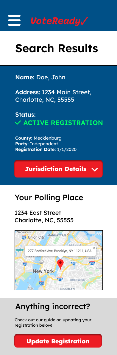
App Search Results

App Election Guide

App FAQ
Desktop Mockups

Desktop Home

Desktop - How to Register

Desktop - Updating Registration

Desktop - Check Registration

Desktop - Search Results

Desktop - Election Guide

Desktop - Voting FAQ
Mobile Site Mockups

Mobile Site - Home

Mobile Site - How to Register

Mobile Site - Updating

Mobile Site - Check Registration

Mobile site - Search Results

Mobile Site - Election guide

Mobile Site - Voting FAQ


Takeaways
Impact
Users shared that they liked the fact that the app was more simple to use than sites like the DMV and included crucial voter information in a more user-friendly format.
What I learned
I learned that while voter turnout and helping people to vote is a large task to solve that would require many solutions, there are feasible solutions that we can do right now to help out.
Next Steps
If I were to continue to work on VoteReady, these would be my next steps:
Work with voter advocacy groups to expand content, especially FAQs
Work with state government to integrate registration into the app.
Study effect on voter turnout.