Ampattire :
Merchandise Purchasing App for Concerts
AmpAttire is a concept for a new app that will allow users to purchase merchandise at a concert for pickup at the show. Completed case study as part of the Google UX Design certificate.
Tool Used: Figma
Date: May 2023
Role: UX Designer and Researcher
Completed Mockups
Project Goal
To avoid lines by creating a concert merchandise purchasing app that allows pickup during or after the show.
What problems is AmpAttire trying to solve?
-
Lines
Lines lead to concert fans missing part of the show or not getting a good spot in standing room only sections. Some avoided merch all together
-
Availability
Often, fans get to the front of the merch line, only to see their size or selected merch is sold out. This is especially common for those who wait until after the show. It can be hard for those who are shorter, in wheelchairs or are visually impaired to see the avaliable merch in line as well.
-
Holding Merch
Purchasing merch before to ensure availability not only means waiting in line, but holding purchases during shows. Some items, like vinyls, are breakable.
Paper Wireframes
I used paper wireframes to ensure layouts would translate to digital well and to more freely iterate on designs.
To the right are some of my refined paper wireframes.
Digital Wireframes and lo-fi prototypes
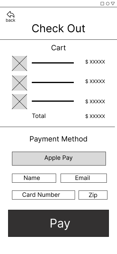
After completing paper wireframes, I began creating digital wireframes in Figma. After I completed the main user flow, I linked the wireframes together to create my lo-fi prototype.
Usability study: findings
I conducted two usability studies. The first study allowed me to make important changes to my designs before they were created into mockups. The second study used my high-fidelity prototype and allowed final refining of the design.
Round 1 findings:
Some users were confused by aspects of the scrolling
Navigation buttons needed to be more prominent
Cart Button needed to be closer to the top
Round 2 findings:
Pickup instructions needed to be moved to the top.
Sizing needed to be included in cart
Mockups
After completing the usability study, I used the feedback to iterate on my designs. For example, early designs had the cart button on the bottom of the page. After the studies, a navigation bar was added with the cart moved to the top and the navigation buttons for shirts, vinyls and more were made much more prominent.
Full mockups and a hi-fi prototype are at the top of the page.
Takeaways and Conclusions
Impact
This app would be helpful for concert fans who want to purchase merchandise without waiting in a line.
A quote from a research participant: “this app sounds easy and simple to use, I would use it at a concert!”
What I learned:
I learned how to layout pages and flows in ways that make sense to users naturally. For example, the cart button on top makes more sense to users than it being on the bottom.
Next Steps for AmpAttire
If I was to continue working on this project, I would:
Conduct further usability studies, potentially at a concert to see how app functions in key environment.
Conduct further study to find areas of need, such as delivery.
Refine pickup process further and test.


